Chapter 4 Lab 4
This is the last lab of semester 1 where the students willl work with data. Lab 5, the last lab of the semester, is where they present their reflections on what they would tell their fresher selves facilitating reflection on how far their skills have come in just 10 weeks. In this lab, lab 4, the students will again load in data, use the tidyverse verbs and generate a plot. Our students are also supported by a short video made by the course lead about ggplot.
4.1 Pre-class activity
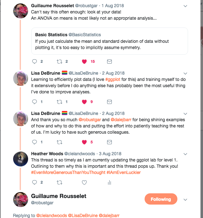
Interesting twitter conversation between Prof Lisa Debruine and Dr Guillaume Rousselet on the importance of visualising data which you will be learning about in this lab
4.2 In-class activities
4.2.1 Getting our data ready to work with
Today in the lab we will be working with our data to generate a plot of two variables from the Woodworth et al. dataset. Before we get to generate our plot, we still need to work through the steps to get our data in the shape we need it to be in for our particular question. You have done these steps before so go back to the relevant script and use that to guide you through. Can you remember when we did this?
OK, so what is our first step? Yup, thats right, we need to tell RStudio where to find all the files we need and pull them in ready for work. Let’s go back to labs 2 and 3 to use our previous script to fill in the code in a new script:
4.2.2 Activity 1: Packages and data
Open up tidyverse and read in data
## Parsed with column specification:
## cols(
##   .default = col_double()
## )
## See spec(...) for full column specifications.## Parsed with column specification:
## cols(
## id = col_double(),
## intervention = col_double(),
## sex = col_double(),
## age = col_double(),
## educ = col_double(),
## income = col_double()
## )4.2.3 Activity 2: Select
Select the columns all_dat, ahiTotal, cesdTotal, sex, age, educ, income, occasion, elapsed.days from the data and creat variable summarydata.
4.2.4 Activity 3: Arrange
Arrange the data in the variable created above (summarydata) by ahiTotal with lowest score first.
4.2.5 Activity 4:Filter
Filter the data ahi_desc by taking out those who are over 65 years of age.
4.2.6 Activity 5: Group and summarise
Group the data stored in the variable age_65max by sex, and store it in data_sex.
Then, use summarise to create a new variable data_median, which calculates the median ahiTotal score in this grouped data and assign it a table head called median_score.
(Hint: if you’re stuck, see …….).
4.2.7 Activity 6: Mutate
Use mutate to create a new column called Happiness which categorises participants based on whether they score above or below the median ahiTotal score.
4.2.8 The importance of plotting
We are now at the point where we can create a plot showing us some data. Why should we do this? This is an interesting thread from our colleagues Dr Guillaume Rousselet and Prof Lisa DeBruine on the reasons why we should use plots and the benefits of using ggplot, the package we will use today in RStudio, to create our plot: https://twitter.com/robustgar/status/1025342313004974080 And as Grolemund and Wickham tells us ’Visualisation is a fundamentally human activity. A good visualisation will show you things that you did not expect, or raise new questions about the data. A good visualisation might also hint that you’re asking the wrong question, or you need to collect different data. Visualisations can surprise you, but don’t scale particularly well because they require a human to interpret them.` http://r4ds.had.co.nz/introduction.html
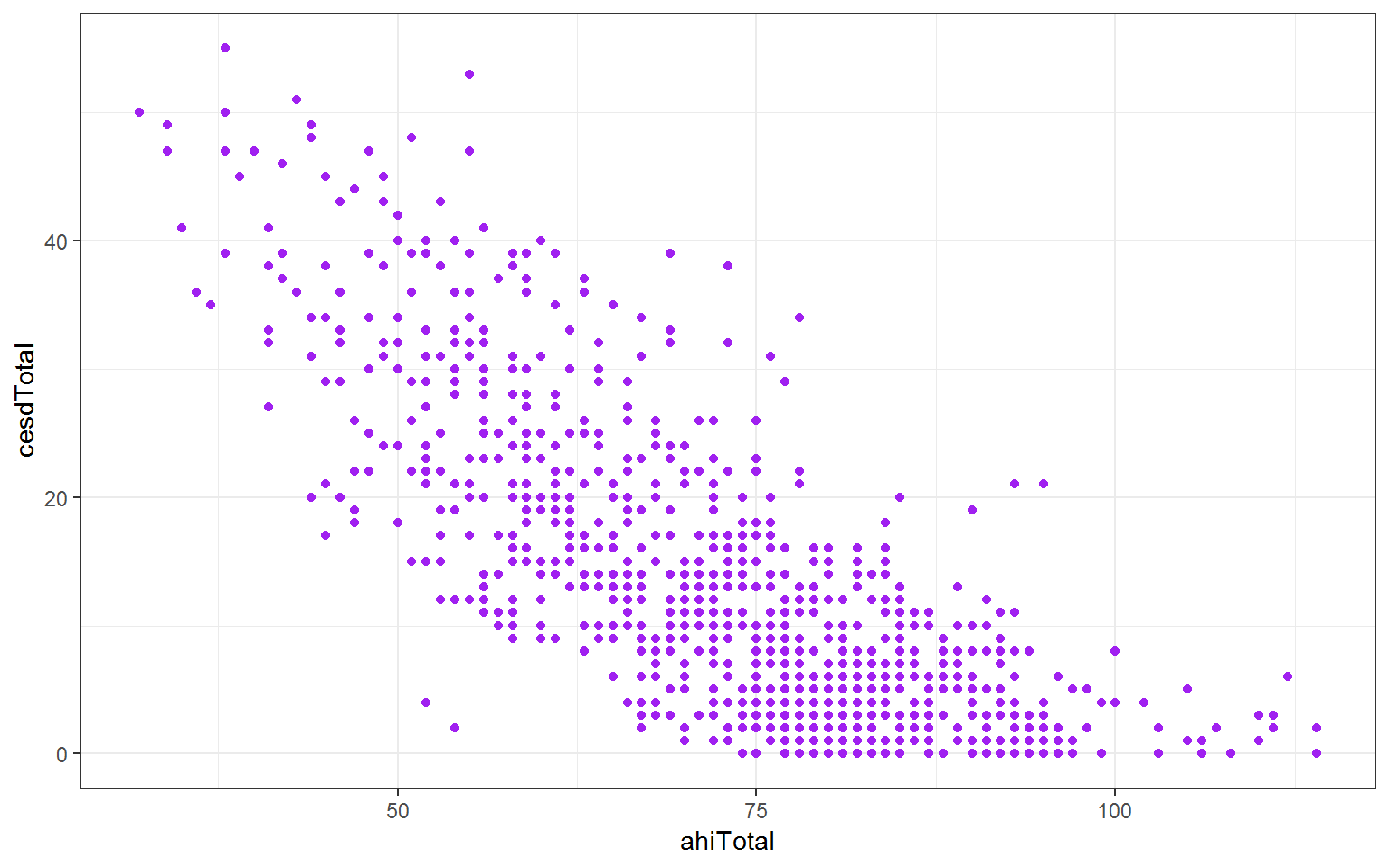
Figure 4.1: Happiness scores for participants aged less than 65 years
Great job! You have now worked with the essential basics of good practice in data wrangling! To show us how you have mastered this complete the assessment and submit by 12pm 1 week from your lab.